When Should You Redesign Your Logo?
Consider a logo redesign when your identity no longer fits your business, creates confusion with competitors, or repeatedly fails where customers encounter it. If the underlying idea still works, a focused refresh may be enough. Start by identifying a specific problem and deciding which recognizable elements are worth keeping.
It is easy to become tired of a logo you see every day. That feeling deserves a closer look, but it does not tell you what your customers need. A familiar logo may still be doing its job, even when you are ready for something different.
When assessing an existing identity, I would begin with what has changed in the business and how the logo performs in use. Those questions give a redesign a clear purpose and help you judge whether the result is an improvement.
Five signs your logo needs a closer look
Your business has outgrown the original idea
Your logo may have been created for a narrower business than the one you run today. A company that once sold one product might now offer a broader service, while its symbol still points to the original product alone.
Review what the logo implies about your business. Does it create expectations that no longer match what you offer? If the original concept actively limits how people understand the company, a new direction may be appropriate. Growth by itself does not require a new logo.
It gives the wrong impression to your audience
A change in customers, positioning, or price level can expose a mismatch in the identity. A playful mark may need reconsideration if the business now serves an audience expecting a more restrained presentation.
Look for specific feedback. Are prospective customers mistaking the type of business you run? Does the visual identity suggest a different level of service from the one you provide?
Check the surrounding presentation, too. Photography, website design, and wording all influence that impression. Changing the logo alone may leave the underlying problem unresolved.
It struggles in the places you actually use it
A logo that looks clear on a large presentation slide can become difficult to read in a mobile header or on a small product label. Thin details may disappear, enclosed spaces may fill in, or the business name may become illegible.
Test the applications that matter to you:
Read the name at its actual website or packaging size.
Check the symbol in a social profile crop, if you use one.
Review a single-color version for the printing methods you need.
A missing compact version may call for an additional layout. A blurry upload may need a better file. Consider redesigning the mark when its underlying construction prevents it from working reliably.
It is too easy to confuse with another business
Compare your logo with the businesses customers are likely to consider alongside yours. Look beyond color at the silhouette, lettering, and overall arrangement.
An industry symbol can be useful, but it should not make your business interchangeable with its competitors. If customers confuse two identities, or the logo relies on a widely repeated visual formula, improving distinctiveness is a reasonable goal.
The aim is to make your business easier to identify while keeping the visual character appropriate to what you do.
The execution weakens an otherwise useful idea
Sometimes the concept is still right, but the drawing needs attention. Awkward spacing, unbalanced proportions, or a poor relationship between the symbol and name can make the identity harder to use consistently.
Describe those problems precisely. “The name becomes hard to read at this size” gives a designer something to solve. “It needs to look more modern” leaves too much open to interpretation.
This is often a reason to explore a refresh before replacing the identity.
Logo refresh or complete redesign
A logo refresh keeps the recognizable foundation and improves how it is drawn or used. That might involve refining the lettering, adjusting proportions, simplifying troublesome details, or developing a compact arrangement.
A complete logo redesign changes the central visual idea. It may be appropriate when the existing symbol communicates the wrong thing, closely resembles competitors, or belongs to a business direction you have moved away from.
There is also a smaller possibility: the logo is sound, but the files or usage system are incomplete. Preparing suitable artwork, background variations, and basic guidelines can resolve practical problems without changing the design.
For example, if a name is difficult to read only because a long horizontal logo is squeezed into a square, start by exploring a better arrangement. If the symbol itself refers to a service the company no longer offers, rearranging it will not address that mismatch.
A wider rebrand may also change positioning, messaging, or the company name. Establish that scope before commissioning a logo so the design responds to decisions that have already been made.
When you should keep your current logo
Age alone is a weak reason to redesign. If the logo remains distinctive, suits your business, and works across the applications you need, keeping it may be the sensible choice.
The same applies when the main motivation is a passing trend, a competitor's recent launch, or your own familiarity with the design. Ask what customers would gain from the change.
Be equally careful about treating a redesign as the answer to weak sales. The offer, customer experience, pricing, or website may need attention. A logo can improve identification and presentation, but it cannot resolve those problems by itself.
If you cannot explain the problem you want to fix, spend more time defining it before starting design work.
Define the problem before choosing a direction
Collect the current logo and a few examples of it in everyday use. Then write down:
What has changed in the business or its audience?
Where does the current logo fail, and what evidence shows that?
Which elements do existing customers recognize?
What must the revised identity do that the current one cannot?
Which applications must be ready for the launch?
Turn the answers into a short brief. “Keep the recognizable symbol, improve the name at mobile sizes, and create a usable square version” is specific enough to guide both design and feedback.
Use the same requirements when reviewing concepts. If you are comparing designers, my guide to choosing a logo designer for your business explains how to assess portfolios, proposals, and working processes.
Preserve the recognition you have already built
Before changing the artwork, identify what makes the current identity recognizable. That could be a distinctive silhouette, a particular letterform, a color relationship, or the way the symbol and name fit together.
Avoid assuming that every detail carries equal value. Ask existing customers what they recognize and check their responses against the actual artwork. A useful element may deserve protection even if its drawing needs refinement.
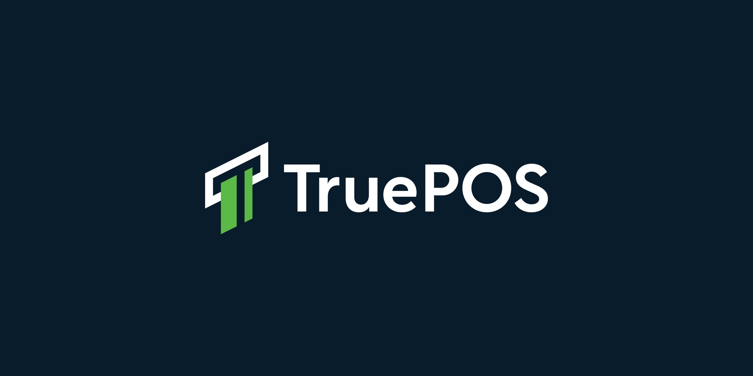
True POS logo concept by Nadir Balcikli, combining the letter T with a card entering a payment terminal.
The True POS identity shows how a visual idea can connect directly to a business. In that design, I combined the letter T with a payment card being inserted into a terminal. The relationship between those elements gives the symbol its meaning. When evaluating any existing logo, look for that kind of useful connection before deciding what to change.
Compare proposed designs with the current logo at the same size and in the same applications. Check whether the name is easier to read, the important details survive, and the business is still easy to identify. Showing one version in an impressive mockup and the other as a small flat image makes the comparison less useful.
Keeping familiar elements can help continuity, but the revised design still needs to solve the problem in the brief.
Plan the transition before launch
The design fee is only one part of a logo redesign. List everywhere the old identity appears and estimate the work involved in replacing it. Your website and social profiles may be straightforward; packaging, signage, and printed stock can require more planning.
Agree on the final variations and files, who will update each application, and how the team will access approved artwork. Prioritize the places where customers are most likely to see or look for your business. If physical materials need a gradual changeover, plan that deliberately.
For an established business, a brief explanation of the change can also help customers connect the new identity with the company they already know. Describe what has changed and what remains relevant to them.
Discuss the rollout when setting the budget and deadline. My guide to professional logo design costs explains the factors behind the design fee; application updates should be considered separately.
Common questions about logo redesign
How often should a logo be redesigned
There is no fixed interval that suits every business. Review the logo when your positioning, audience, name, or practical requirements change. Redesign when you can identify a problem that a design change would address.
Can you keep your existing colors
Yes. A redesign can retain colors or other recognizable elements. Decide what to keep based on its value to the identity and its suitability for the new direction. Changing every element is not a requirement.
Does converting a logo to vector count as a redesign
Recreating the same artwork as a vector file is usually technical preparation. It can solve file-quality problems, but it will not fix a confusing concept or an unsuitable visual style. Agree on whether the task is reproduction or design development before work begins.
Discuss your logo with me
I am Nadir Balcikli, an independent logo designer creating minimal, modern identities for businesses worldwide. You can explore my logo design portfolio to see my approach.
If you are considering a refresh or redesign, tell me about your project. Share your current logo, what has changed in the business, and where the identity needs to work. That gives us a practical starting point for discussing the scope.