What Makes a Good Logo? A Practical Guide for Business Owners
A good logo gives a business a clear, recognizable visual identity. It suits the business and its audience, has a distinctive character, and works in the places where customers will see it. Simplicity, readable lettering, and a relevant idea all contribute to that result.
Evaluating a logo can still feel subjective. You might like one concept immediately and feel unsure about another. Those reactions are worth discussing, but a useful decision also needs a connection to the business.
A logo can impress every designer in the room and still be wrong for the business. Here are the things I would look at when deciding whether a design is doing its job.
It fits the business and its customers
Start with the impression the logo needs to create. What should someone understand or feel when they encounter the business? Which qualities matter most to the people you want to reach?
A toy brand and a technical consultancy might both want to appear approachable. The visual choices that make sense for each could be very different. Rounded lettering, expressive shapes, or a restrained layout need to be considered in context.
Try to make broad descriptions more specific. If you want the business to look professional, does that mean precise, established, discreet, or confident? That gives you and your designer something clearer to discuss.
The logo can suggest those qualities without describing every service you offer. Leave room for the name, messaging, photography, and wider identity to contribute. A focused design also gives you more flexibility if the business expands into related products or services.
It has a distinctive character
Look at the logo alongside the competitors your customers are likely to consider. Compare the overall shape, lettering, proportions, and arrangement, as well as the colors.
Can you identify something particular about this design? That might be an unusual silhouette, a carefully drawn letter, or a strong relationship between the symbol and the name. A small, deliberate detail can give an otherwise simple logo its character.
Familiar visual cues can help people place a business in a category. The challenge is to use them in a way that gives the identity its own presence. If several competitors use similar symbols and layouts, explore what could make yours easier to distinguish.
Recognition also develops through repeated use. Give customers a consistent identity to become familiar with across your website, products, communications, and other points of contact.
It stays clear where you need to use it
A presentation shows you a design under chosen conditions. Your everyday applications will reveal whether it is practical.
Ask to see the logo in the settings that matter to your business, at realistic sizes. For example:
In a website header viewed on a phone.
Inside the circular crop of a social profile.
On the smallest product label you need.
In a single ink color, if your printing requires it.
Against the light or dark backgrounds you regularly use.
Check whether the name remains readable and whether small spaces or fine details disappear. Look at the symbol and lettering together, as well as any versions intended to be used separately.
For my Strongkeep logo design, the symbol brings together an S, a shield, and fortress battlements. The black and white versions show how those elements form one shape. Viewing a design this way helps you assess its structure and the spaces within it.
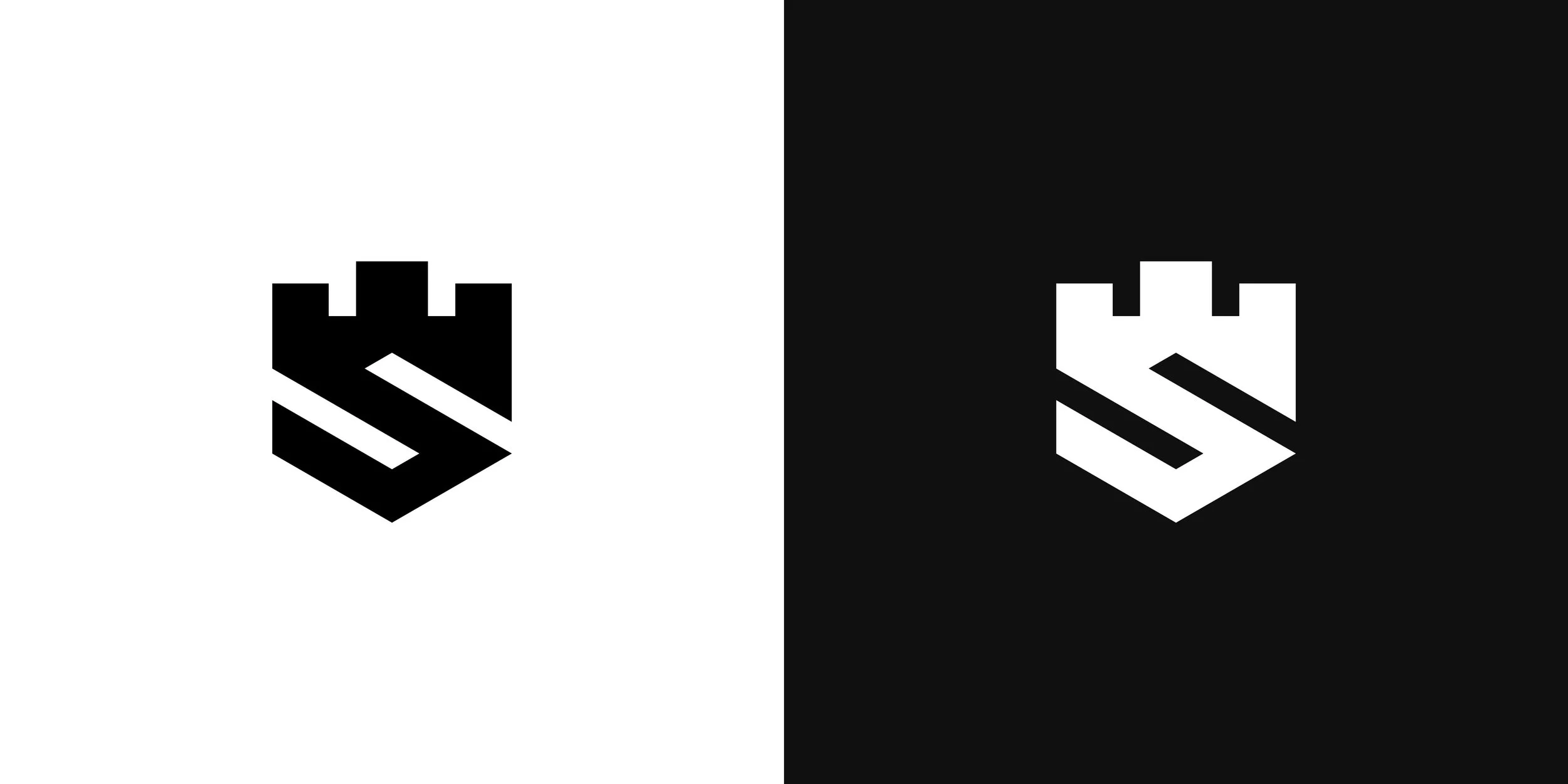
Strongkeep logo in black and white, designed by Nadir Balcikli.
A logo may need a horizontal arrangement, a stacked version, or a compact symbol for different applications. Agree on the versions your business actually needs, and check that they feel like parts of the same identity.
Its visual idea serves a purpose
An idea can give a logo a useful connection to the business. It can come from the name, the product, the audience, or a quality the company wants to express.
In my Fastfood logo design, a cheetah's face is combined with a fork formed through negative space. The cheetah relates to speed, while the fork connects the symbol to food. Together, they give the design a relevant idea for a food delivery platform.
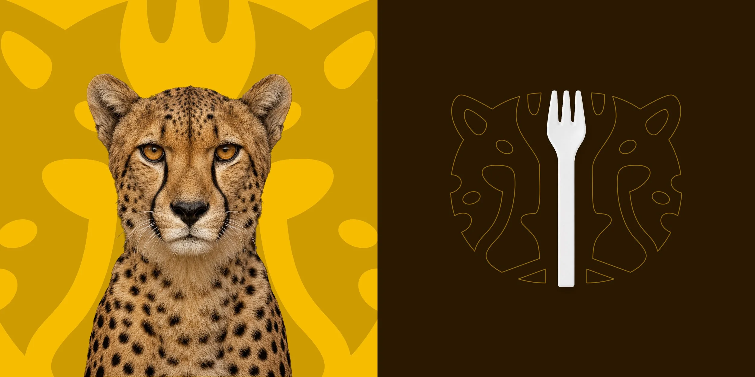
The cheetah and fork concept behind my Fastfood logo design.
When reviewing a concept like this, consider both the meaning and the result. Does the connection make sense for the business? Does the finished shape remain clear? Is the idea adding something useful?
A hidden detail can be enjoyable to discover, but the logo should still work before someone notices it. Trying to fit too many meanings into one symbol can make the form harder to read.
A distinctive wordmark can also be a complete solution. Decisions about lettering, spacing, and proportion can express the right character without adding a separate symbol. The appropriate approach depends on the name and the identity you need.
You can explain why it works for your business
Your preferences matter. You will use this identity regularly, and you should feel comfortable with it. Connecting those preferences to the project gives everyone a stronger basis for making decisions.
For example, "I prefer the second concept because its compact shape will work well on our packaging" identifies a practical strength. "The lettering feels too informal for the customers we want to reach" identifies a concern the designer can investigate.
Both comments give you something to discuss and test.
When comparing concepts, return to a few questions:
Does the design express the qualities we agreed on?
What gives it a recognizable character?
Can customers read the name where it will actually appear?
Does the idea feel relevant to the business?
Are there specific problems we need to resolve before approval?
If you ask customers or colleagues for input, explain the context and ask about particular issues. A question such as "Can you read this name at the size it will appear on the label?" produces more actionable feedback than an open vote on everyone's favorite.
This is also where a clear logo design process helps. The brief gives you shared criteria, and refinement gives you a way to resolve the concerns that come up.
Give the logo a clear role in the wider brand
A logo is one part of how people experience a business. Your product, service, communication, and consistency all contribute to the reputation associated with it.
The logo's role is to give that business a recognizable visual identity. Over time, people connect the design with their experience of the company.
When you evaluate a logo, look for a relevant idea, a distinctive form, and dependable use in everyday settings. Those qualities give you a sound basis for choosing an identity you can use consistently.
Work with me on your logo
I am Nadir Balcikli, a freelance logo designer creating minimal, modern identities for businesses worldwide.
If you are planning a new logo, tell me about your project. Share what your business does, who you want to reach, and where the logo will be used, and we can discuss the right direction.