Logo design creates the mark that identifies your business. Brand identity design develops the visual system around it, including colors, typography, supporting graphics, and guidance for using them together. The right scope depends on what you already have and what you need to produce.
You might need a new logo for an otherwise consistent business. You might be launching with a website, packaging, and sales materials that all need a shared direction. Those are different design projects, even if both begin with a conversation about a logo.
Before asking for a quote, it helps to understand which decisions you need the designer to resolve.
What is the difference between logo design and brand identity?
A logo is a specific identifying design. It may be a wordmark, a symbol, or a combination of the two. A visual identity defines how that logo works alongside the other elements your business uses to communicate.
The term brand identity can also cover verbal elements, such as messaging and tone of voice. Here, I am focusing on visual identity, which is the area I work on as a designer.
| Comparison | Logo design | Visual identity design |
|---|---|---|
| Main focus | A recognizable mark for the business | A consistent visual approach across materials |
| Typical elements | Symbol or wordmark, logo arrangements, color versions, final artwork | Logo system, color palette, typography, supporting graphics, usage guidelines |
| Practical question | Can people identify the business where the logo appears? | Can different materials look like they belong to the same business? |
Swipe horizontally to compare.
There is some overlap. A logo project usually involves color and typography decisions. The difference is how far those decisions extend beyond the logo itself.
What does a logo design project cover?
A logo project addresses the business name, the visual idea, and the way the finished mark needs to function. Depending on the brief, it can include a primary arrangement, an alternative layout, a separate symbol, and versions for different backgrounds.
For example, a website header may need a horizontal logo, while a social profile needs a compact version. Both are part of making the same design usable.
The lettering in a logo is another specific decision. It does not automatically determine which fonts should be used for website headings, presentation slides, or everyday documents. Those choices belong to the wider identity.
If you are evaluating the logo itself, my guide to what makes a good logo explains the qualities to look for.
What does a wider visual identity add?
A visual identity gives you a set of decisions to use when creating new materials. Depending on the project, it can include:
A color system: Primary and supporting colors, with guidance on their roles and combinations.
Typography: Typefaces and a hierarchy for headings, body text, and other recurring uses.
Supporting graphics: Shapes, patterns, or other elements that give the materials a recognizable character.
Layout and imagery direction: Guidance on composition, spacing, photography, or illustration where these are needed.
Usage guidelines: Practical instructions and examples for the people applying the identity.
Specific templates or finished applications can also be included when agreed. A brand guidelines document and a ready-to-edit presentation template are separate deliverables, so the proposal should make that distinction clear.
The useful outcome is that your team can create the next document or brief the next supplier with fewer visual decisions left unresolved.
A practical example: True POS
For my True POS logo design, I combine the letter T with the idea of a payment card entering a terminal. That connection gives the symbol a meaning related to the business.
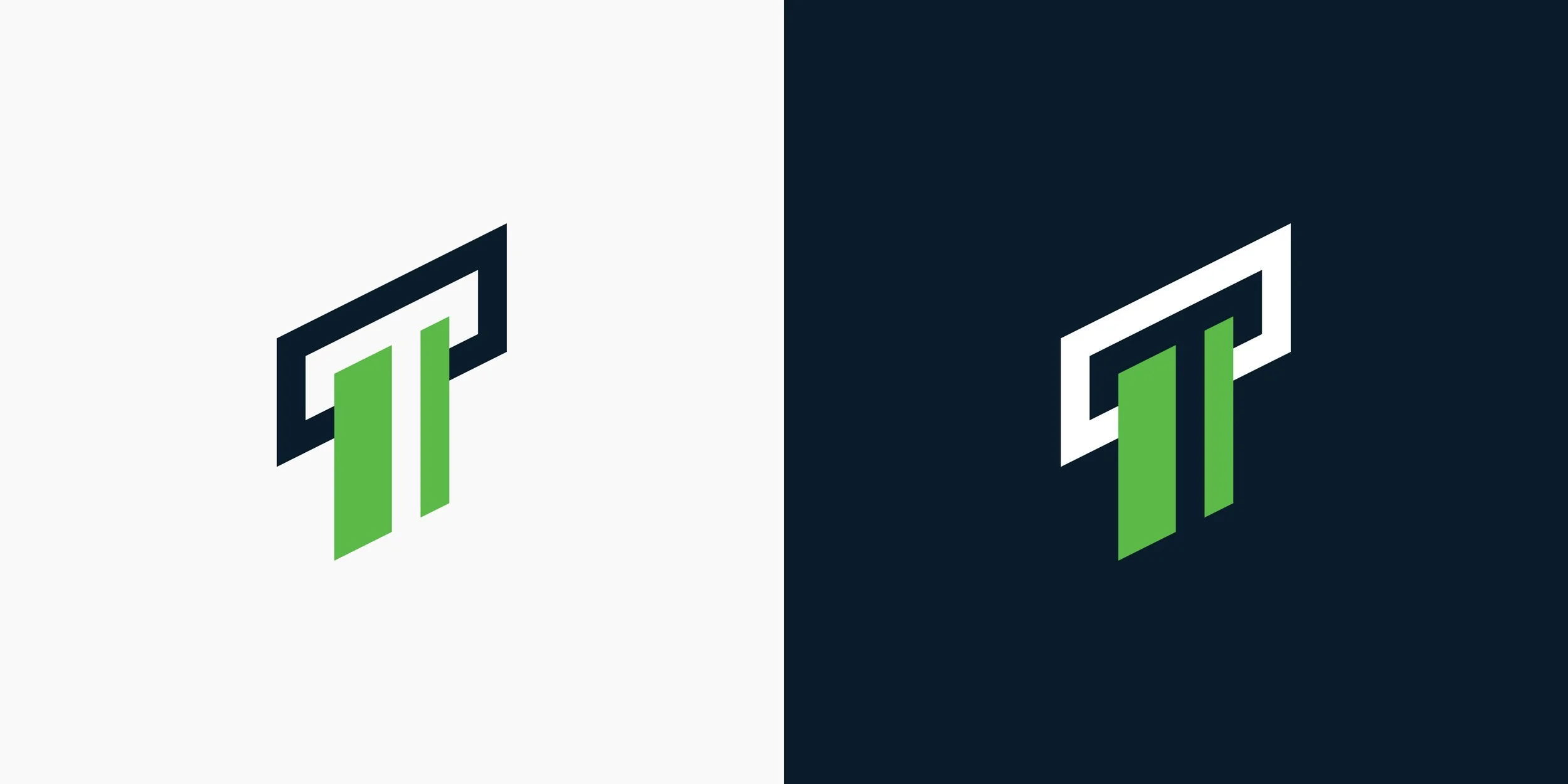
True POS logo variations, designed by Nadir Balcikli.
The project presentation also shows the logo on light and dark backgrounds and in applications such as a payment terminal and a billboard. These examples help illustrate the difference in scope.
The logo provides the identifying mark. The surrounding choices, including the green and navy palette, typography, and layout, affect how the whole application feels. Placing the same logo on several materials still leaves those surrounding decisions to be made.
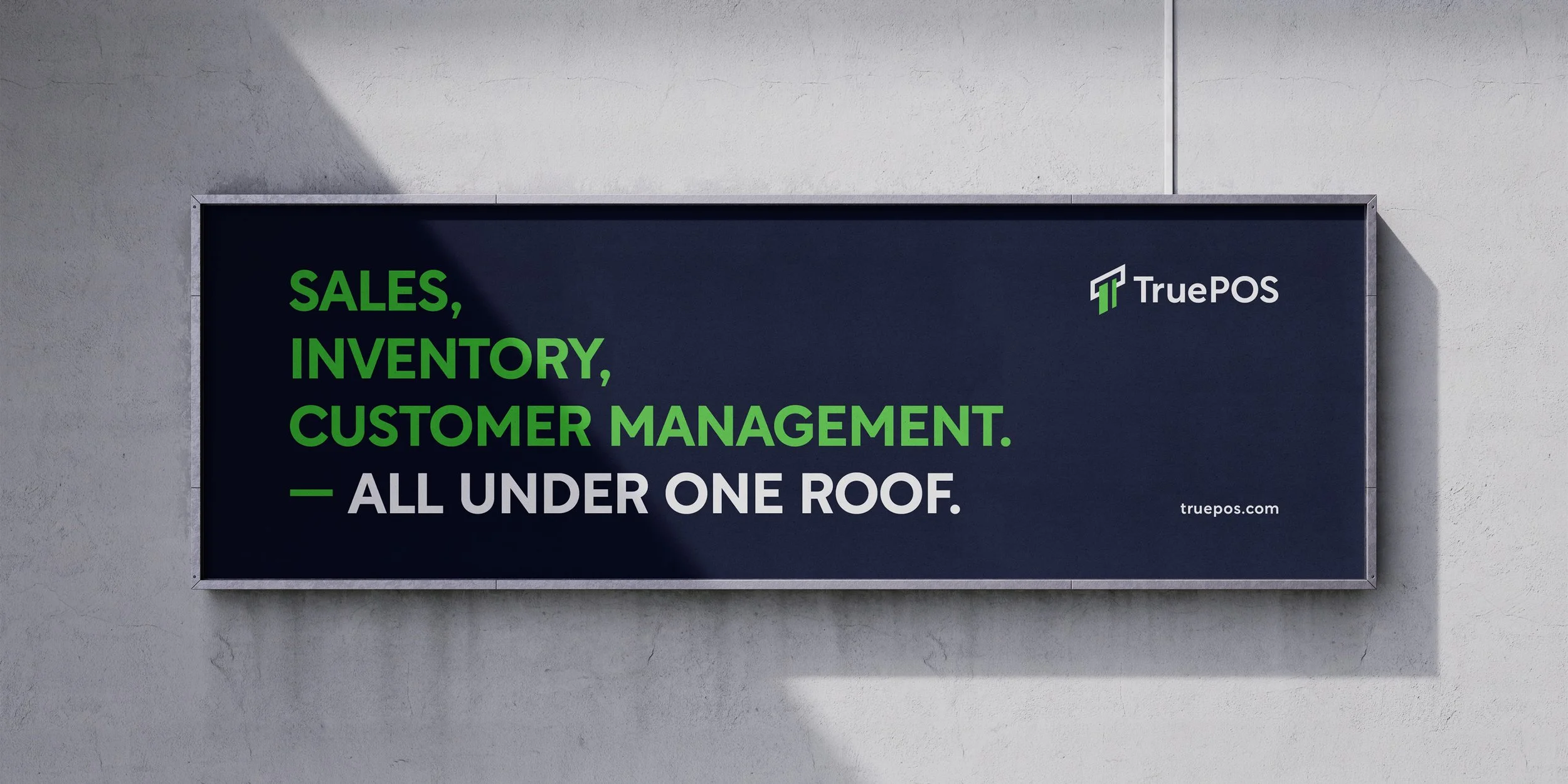
A True POS billboard presentation showing the logo alongside color, typography, and layout.
When is a focused logo project enough?
A focused logo project can make sense when the rest of your visual identity already works. Perhaps your website, documents, and marketing materials follow a clear system, but the current logo is difficult to read or does not suit the business anymore.
It can also be a sensible starting point for a business with a small, clearly defined launch. In that case, agree on the essential versions and any basic color or typography guidance you need to use the design consistently.
The scope should resolve the immediate requirements while leaving a clear basis for future work. You do not need to commission every possible application before knowing whether you will use it.
When should you consider a wider identity?
A wider identity becomes useful when the uncertainty extends beyond the logo.
Your sales presentation might look formal, your social posts playful, and your website unrelated to either. Replacing the logo would leave those differences unresolved.
Other reasons to consider a broader project include:
Launching several customer-facing materials that need a shared visual direction.
Having different people or suppliers create materials without common guidance.
Expanding into packaging, signage, or other applications your current identity does not address.
Keeping a suitable logo while improving the colors, typography, and layouts around it.
That last situation matters. An effective existing logo can remain the foundation of a new visual system. A wider identity project does not always require replacing it.
How to define the right scope before requesting a quote
Start with a list of the materials you expect to need over the next six to twelve months. Include the practical details: a small product label places different demands on the identity from a presentation shown on a large screen.
Then explain:
What already exists and which parts you want to keep.
Where the current design creates problems.
Who will create and update your materials.
Which finished files, templates, or guidelines you need.
Your budget and any confirmed launch date.
This gives the designer a useful basis for recommending the work. It also makes proposals easier to compare because you can see which decisions and deliverables each fee covers.
For more on how scope affects the fee, see my guide to professional logo design costs.
Discuss your logo or brand identity project
I am Nadir Balcikli, a freelance logo designer working directly with businesses worldwide. My design services include original logos, redesign, refinement, and wider visual identities.
If you are unsure how much your business needs, share what you already have and the materials you are planning. I will review the details and recommend a scope for your project.